Long workflow names are truncated in UI #14398
Replies: 10 comments 2 replies
-
|
Thanks @scott-doyland-burrows - we don't have any work in flight to change this but I'll put this on the backlog and discuss with the design team. I appreciate the feedback. |
Beta Was this translation helpful? Give feedback.
-
|
Chiming in as this impacts my day-to-day flow a fair bit. @ethomson thanks for engaging! Has there been any movement on this in the interim? For context, I've been trying to advocate for Github Action use internally in my org. The biggest pushback has been that it is hard to find workflows and figure out what they're doing. I agree that that's one area where Actions don't perform very well, and items like this feel like low-hanging fruit that could go a long ways to improving the user experience. It seems kind of silly that I, as a user, have no ability to read the list of my action names at a glance, when roughly 1/5 of my screen real estate is sitting unused on either side of my monitor.
|
Beta Was this translation helpful? Give feedback.
-
|
The same problem. I have about 50 workflows with names contains 30-35 letters. |
Beta Was this translation helpful? Give feedback.
-
|
The same problem. API call returns me 3 jobs with truncated name terragrunt-workflow / Plan (provisioning-maradiy-io, provisioning-development, provisioning/terragrunt/provisioning-mar... and I can't identify which I should to select by name. |
Beta Was this translation helpful? Give feedback.
-
|
This discussion is opened for more than 2 years and not resolution so far. This is a basic UI functionality missing that I believe impacts more people than you may think of. What can we do for GH's product team to give it proper attention? |
Beta Was this translation helpful? Give feedback.
-
|
Same here |
Beta Was this translation helpful? Give feedback.
-
|
Hey sorry product hasn't responded here. Right now I think we truncate based on the screen size :), this means most people are seeing around ~30ish characters here for a name. I would <3 to know what resolutions y'all are testing at that see this much white space :) |
Beta Was this translation helpful? Give feedback.
-
|
Thanks for taking a look at this! My screen resolution is 2560x1440 and this is what I see in GitHub actions (I count 31 characters shown in one of the lines that gets cut off). There certainly seems to be a great deal of unused horizontal space. As far as I am aware, there is no way to click-and-drag to enlarge the left column, is that correct?
|

Beta Was this translation helpful? Give feedback.
-
|
Thank you for such a quick response! You are correct to the best of my knowledge :) I will add a paper cut to our backlog to make this drag-to-enlarge as this seems like a smaller and yet viable solution here. We have quite the backlog of paper cuts! But this will now be on there to be reviewed routinely by our team :) |
Beta Was this translation helpful? Give feedback.
-
|
💬 Your Product Feedback Has Been Submitted 🎉 Thank you for taking the time to share your insights with us! Your feedback is invaluable as we build a better GitHub experience for all our users. Here's what you can expect moving forward ⏩
Where to look to see what's shipping 👀
What you can do in the meantime 💻
As a member of the GitHub community, your participation is essential. While we can't promise that every suggestion will be implemented, we want to emphasize that your feedback is instrumental in guiding our decisions and priorities. Thank you once again for your contribution to making GitHub even better! We're grateful for your ongoing support and collaboration in shaping the future of our platform. ⭐ |
Beta Was this translation helpful? Give feedback.
-
|
anything would be better: resizeable sidebar, hover over with full name shown, or even yml to override and change the job name to multiple lines when nesting is used |
Beta Was this translation helpful? Give feedback.
-
|
My monitor is 1080p. I'm not doing anything odd with the resolution. I'm using Windows and it's set to normal/100% resolution andvthe browser is zoomed to 100%.
|
Beta Was this translation helpful? Give feedback.
Uh oh!
There was an error while loading. Please reload this page.
-
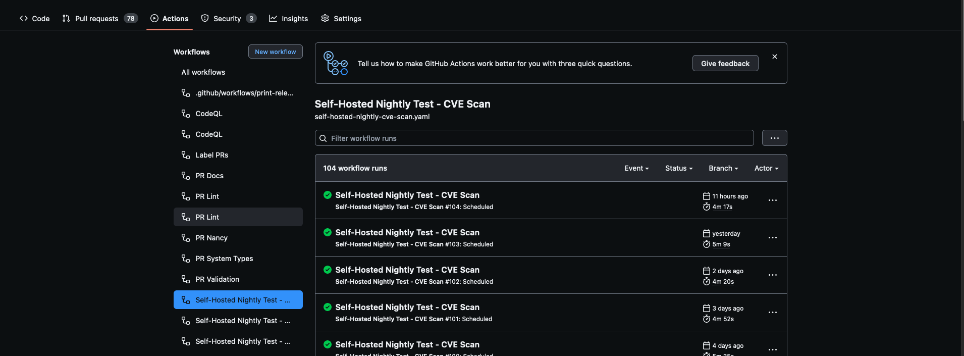
Hi,
In the GHA workflow page, I see this:
As you can see, the workflow names are truncated and even though these are two different named workflows I cannot easily see which is which without hovering over them.
There is a lot of wasted "white" space to the left and right of the page that could be used to accommodate longer names.
Please can the layout of the GHA workflow page be altered to allow longer names to fully show up.
Beta Was this translation helpful? Give feedback.
All reactions