Tabs #1
There are no files selected for viewing
| Original file line number | Diff line number | Diff line change |
|---|---|---|
| @@ -1,36 +1,46 @@ | ||
|
|
||
| # RFC : Technical design document | ||
|
|
||
| ## Component - Tab | ||
|
|
||
| ### Scope of the Document | ||
|
|
||
| This document outlines the technical design document of Tab component functionalities. Its highlights the component design, properties, and initial implementation. | ||
|
|
||
| ### Component Overview | ||
|
|
||
| Tabs organize and allow users to move between content without having to navigate away from a page. The Tabs component organizes multiple sections of related content so a user can view one section at a time. | ||
|
|
||
| ### Component Design | ||
|
|
||
| > Component designed based on the scope of the tab component, by default, the Tab simply renders data passed to it. | ||
|
|
||
| ### Scope | ||
|
|
||
| - Tab Container: Tab container is a component that manages the context and state of the tabs. | ||
| - Tab List: Wrapper for the tab components. | ||
| - Tab: Element that serves as a label for one of the tab panels and can be activated to display that panel. | ||
| - Tab Panel: Is a presentational component which accepts a tab’s content as its children. | ||
|
|
||
| #### Tabs | ||
|
|
||
| The component or element the *Tabs* should render as *Fragment*. | ||
|
|
||
| Provides context and state. | ||
|
|
||
| ##### Properties | ||
|
|
||
| | Props | Type | Default | Required | Description | | ||
|
There was a problem hiding this comment. Evan had a comment about the Required field in the SharePoint version. You responded but I am not clear on what the end result is supposed to be. There was a problem hiding this comment. The result should be that all rows need either There was a problem hiding this comment. Based on Evan's comment from Friday, each cell in the Required column (in each section) needs to have a value of Yes (True) or No (False) |
||
| | :------------- |:-------------:|:-------------:|:-------------:|:-------------| | ||
| | ClassName| Object | | | Override or extend component style.| | ||
| | Id | String | | | Unique identification of tabs. | | ||
|
|
||
| #### TabList | ||
|
|
||
| The component or element the *TabList* should render as *div*. | ||
|
|
||
| ##### Properties | ||
|
|
||
| | Props | Type | Default | Required | Description | | ||
|
There was a problem hiding this comment. I think the diff is off because you accidentally pushed this to
@erinoh |
||
| | :------------- |:-------------:|:-------------:|:-------------:|:-------------| | ||
| | ClassName| Object | | | Override or extend component style.| | ||
|
There was a problem hiding this comment. The below are observations...not necessarily anything wrong
There was a problem hiding this comment.
There was a problem hiding this comment. Not sure if my last question was answered. Are the Descriptions for SelectedIndex (line #51) and onSelected (line #52) supposed to be the same? There was a problem hiding this comment. Right, the |
||
|
|
@@ -45,7 +55,9 @@ The component or element the *TabList* should render as *div*. | |
|
|
||
| The component or element the ‘**_Tab’_** should render as ‘**_button’._** | ||
| Children of Tablist component, display based on label, by default index is 0 | ||
|
|
||
| ##### Properties | ||
|
|
||
| | Props | Type | Default | Required | Description | | ||
|
There was a problem hiding this comment. I can't comment on some of the other props, so here's my feedback:
// this JSX:
<Tab defaultIndex={1}>Animals</Tab>
<Tab defaultIndex={0}>Plants</Tab>

// renders to this HTML:
<button role="tab">Plants</button>
<button role="tab">Animals</button>
And if so, could you help me understand why that's necessary? |
||
| | :------------- |:-------------:|:-------------:|:-------------:|:-------------| | ||
| | Active| Boolean | | | Selected, Unselected flag, based on this flag active tab.| | ||
|
There was a problem hiding this comment. More observations...not necessarily anything wrong
There was a problem hiding this comment. @Apatil15 , were any of these bullets addressed? There was a problem hiding this comment. The Specification document lists the States as:
There was a problem hiding this comment. Right, There was a problem hiding this comment. In addition to the naming and description comment that @dmedjordan made, could you clarify how this works in conjunction with <TabList selectedIndex={1}>
<Tab selected>Animals</Tab> // index={0}
<Tab>Plants</Tab> // index={1}
</Tab>Which way of setting the selected tab wins? |
||
|
|
@@ -55,76 +67,87 @@ Children of Tablist component, display based on label, by default index is 0 | |
| | ClassName | Object | | =Orientation| Override or extend component style. | | ||
|
|
||
| #### TabPanel | ||
|
|
||
| The component or element the ‘**_TabPanel’_** should render as ‘**_div’._** | ||
|
|
||
| element that contains the content associated with a tab | ||
|
|
||
| ##### Properties | ||
|
|
||
| | Props | Type | Default | Required | Description | | ||
| | :------------- |:-------------:|:-------------:|:-------------:|:-------------| | ||
| | ClassName| Object | | | Override or extend component style.| | ||
| | Id | String | | | Unique identification of tabpanel. | | ||
| | Children | Node | | | Any component or element. | | ||
|
|
||
| ### Design Flow | ||
|
|
||
| <img width="596" alt="image" src="https://user-images.githubusercontent.com/25932161/138617008-1f0f2e72-e5da-4d7c-882d-496c9ca21635.png"> | ||
|
|
||
| ### Component Style | ||
|
|
||
| #### Mixings | ||
|
|
||
| - nds—tabs (base) | ||
| - nds-tabs__tablist | ||
| - nds-tabs__tabpanel | ||
| - nds—tabs__tab | ||
|
There was a problem hiding this comment. The SharePoint version did not have nds-tabs_tab listed There was a problem hiding this comment. This looks like it's in response to my point about following BEM conventions to encode the anatomy.
|
||
|
|
||
| ### Keyboard Intraction | ||
|
There was a problem hiding this comment. I really like this being included here since it's part of what will need to be implemented, but some of this is currently being articulated in the functional design acceptance criteria, isn't it, @dmedjordan? Would you want to merge the two or just use the functional design Jira ticket as the source of truth for expected interaction behaviors like this? |
||
|
|
||
| | Key | Action| | ||
| | :------------- |:-------------| | ||
| | ArrowLeft| Move focus to previous tab. | | ||
| | ArrowRight| Move focus to next tab. | | ||
| |Tab | Focus moves into the tablist from the place of active tab. | ||
| |Space or Enter | Activate tab if tabs are not activated. | ||
| |Home | Focus move to first tab. | ||
| |End | Focus moves to last tab. | ||
|
|
||
| ## Accessibility | ||
|
There was a problem hiding this comment. This is great in general, thanks for including it! I do think it would be even more effective if required attributes like Perhaps each component should have an "Attributes" section that would include attributes that are required for accessibility, but also potentially for other relevant attributes that you'd use to accomplish core functionality like the the |
||
|
|
||
| ### ARIA Roles | ||
|
|
||
| #### Tab | ||
|
|
||
| | Role | Description| | ||
| | :------------- |:-------------| | ||
| | role=”tab”| Indicate that is tab. | | ||
| | aria-selected| Set for active tab. | | ||
| | aria-control | Set associate id. | ||
|
|
||
| #### TabList | ||
|
|
||
| | Role | Description| | ||
| | :------------- |:-------------| | ||
| | role=”tablist”| Indicate that is tablist. | | ||
| | aria-orientation| Indicate horizontally or vertically tab. | | ||
|
|
||
|
There was a problem hiding this comment. In the SharePoint version, there was a section for TabPanel: There was a problem hiding this comment. I missed this, |
||
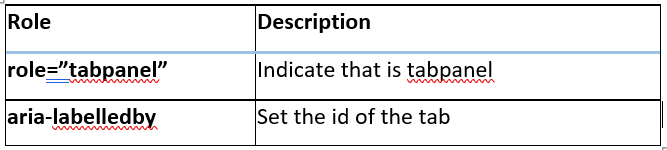
| #### TabPanel | ||
|
|
||
| | Role | Description| | ||
| | :------------- |:-------------| | ||
| | role=”tabpanel”| Indicate that is tabpanel. | | ||
| | aria-label| may be used on any element, not just labelable elements. | | ||
|
|
||
| ## Implementation example | ||
|
There was a problem hiding this comment. I'd love to see more smaller examples interspersed throughout your design rather than one big one at the end. For instance, under <Tab selected>Animals</Tab>
// should render to this HTML
<button class="nds-tab" role="tab" aria-selected="true">Animals</button>I don't know if that's actually accurate to your design, but you hopefully get the idea...smaller examples that tell more of a story. |
||
|
|
||
| <Tabs index={tabIndex} onSelect={handleTabsChange}> | ||
| <TabList> | ||
| <Tab>One</Tab> | ||
| <Tab>Two</Tab> | ||
| <Tab>Three</Tab> | ||
| </TabList> | ||
| <TabPanel> | ||
| <span>This is tab one</span> | ||
| </TabPanel> | ||
| <TabPanel> | ||
| <p>This is tab two</p> | ||
| </TabPanel> | ||
| <TabPanel> | ||
| <div>This is tab three. </div> | ||
| </TabPanel> | ||
| </Tabs> | ||
|
|
||
|
There was a problem hiding this comment. There is a Rendering example in the SharePoint version (appears to be the same as the Implementation example) There was a problem hiding this comment. Was the Rendering example not needed? |
||
| ## Component render example | ||
|
|
||
|
|
@@ -146,7 +169,9 @@ element that contains the content associated with a tab | |
| </ Fragment > | ||
|
|
||
| ### Anatomy document | ||
|
|
||
| [https://docs.google.com/document/d/1D0MjvCYdCaaHDJGYcPk8u9pSREkVpAac8JqNYzviHc0/edit#heading=h.5old1136lvpw](https://docs.google.com/document/d/1D0MjvCYdCaaHDJGYcPk8u9pSREkVpAac8JqNYzviHc0/edit#heading=h.5old1136lvpw) | ||
|
|
||
| ### Refs | ||
|
|
||
| <https://www.w3.org/TR/wai-aria-practices-1.1/examples/tabs/tabs-1/tabs.html> | ||
Uh oh!
There was an error while loading. Please reload this page.
There was a problem hiding this comment.
Choose a reason for hiding this comment
The reason will be displayed to describe this comment to others. Learn more.
The version on SharePoint has Tabs rendered as 'div'. Evan presented rational for both. Just wanted to make sure 'Fragment' is where the final decision landed.
There was a problem hiding this comment.
Choose a reason for hiding this comment
The reason will be displayed to describe this comment to others. Learn more.
Tabs is just a wrapper on tab list and tab panel, without any events, In case add any events or pros it would be carry forward to the child element like tab list.