Add light theme #120
Add light theme #120
Conversation
 adtac
force-pushed
the
adtac/light
branch
2 times, most recently
from
adtac
force-pushed
the
adtac/light
branch
2 times, most recently
from
a7aeeae to
9c28b1f
Compare
|
I'm not very good with frontend stuff, so please feel free to point out anything stupid lol |
There was a problem hiding this comment.
Initial impressions are good, but some of the features from the current styling are missing.


The biggest concern here is contrast. As you can see, the light theme lacks contrast between the matched portions of the text and the popup background, and the initial popup entry has the same background colour as the search field.
I would also like it if the active-item highlighting was a bit more subtle. At the moment the change feels much more distinct than it is in the dark theme. Perhaps darkening the entry background might help improve this, and resolve the background contrast issue above at the same time.
I think your choice of colours generally is excellent - other than the points above, contrast is largely excellent, and the colours look attractive and match well, without being too aggressive.
|
@erayd thanks for the review. Previously, match text colour was coupled with the hint background colour for some reason. I've decoupled the two now, so it should be much better. Here's what the popup looks like now:
I've amended the light theme commit as well. |
 adtac
force-pushed
the
adtac/light
branch
3 times, most recently
from
adtac
force-pushed
the
adtac/light
branch
3 times, most recently
from
9da0e5f to
1b6680a
Compare
|
(Made the badge a bit less dark to improve text contrast.) |
|
Definitely improving - thanks for your work on this 👍 . Can you add some colour (or better contrast) back to the domain badge in the search field? It's fading into the background a bit:
Other StuffThere is no noticable difference in the search field background colour based on whether it's focused or not. Compare with the dark theme to see what I mean - the dark theme gets this bit right. If the search field were generally lighter, that might make this easier to resolve. I know I asked for some contrast between the search field and the entries, but you don't need quite as much as is there now, and if it's causing problems then toning it down a little might be a simple fix. When moving focus from the search field to the first item (e.g. by pressing the down-arrow key), the first item gets much lighter, and gives the impression that it's just been deselected. Changing the colour or shade is fine, but it needs to indicate to the user that this element has gained focus, not lost it. |

|
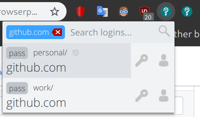
Here's another screenshot showing what it looks like with multiple custom stores configured: |

|
@erayd updated. I was a bit hesitant to add non-grey colours to the mix as I didn't want it to be jarring, but I suppose it's alright to make the badge stand out a bit more.
Hover is now darker than active so that it's more intuitive. The search field gets subtly lighter when it goes out of focus as well. |

|
Getting there. Now the domain badge has very low contrast with the 'remove-domain-badge' button though. Perhaps a light blue or something maybe? |
|
Heh, you have a very keen eye, I missed that. Updated to a safer yellow :) |
src/popup/colors.less
Outdated
| .part.login > .action:focus, | ||
| .part.login:focus > .name { | ||
| background-color: @hover-bg-color; | ||
| outline: none; |
There was a problem hiding this comment.
I think outline needs to be declared in popup.less, not here
src/popup/popup.js
Outdated
|
|
||
| document | ||
| .getElementsByTagName("html")[0] | ||
| .setAttribute("class", "colors-" + settings["theme"]); |
There was a problem hiding this comment.
Use .classList.add(`colors-${settings.theme}`), so that we don't accidentally override an existing class on <html> tag (now or in future).
There was a problem hiding this comment.
In addition, please move this snippet to an earlier stage in the function, right after we retrieve settings. Right now I see a visible change of colors, when I open the popup, at first it is something white, and then in a split second it changes to dark theme.
Managed to catch a screenshot of it:

I confirm that this fixes the issue for my particular case, but to be on a safe side, can we perhaps even add class="colors-dark" directly in popup.html, to keep the theme by default dark even while we are loading settings? And this snippet would need to be adjusted to something like:
const root = document.getElementsByTagName("html")[0];
root.classList.remove("colors-light", "colors-dark");
root.classList.add("colors-${settings.theme}");
|
Finally got to try this! Here's some of my feedback:
|


|
/cc a couple of people who I recall to be passionate about design and everyone who upvoted #98 so far, just to get a couple of extra opinions: @DamienCassou, @532910, @JanMa, @jakubtopic, @Tharre. If anyone can't compile the branch to test, I'm willing to provide test builds, just say so. I'd very much prefer to spend an extra time and get this right on the first try, so please, early feedback is very welcome. |
|
The buttons look grayed out/disabled indeed. The darker blue looks the nicest to me, but you might want to tone down the red if you go with it. |
I disagree with this point - I actually think the way he's done the highlighting is spot on. Yes, it's different, but I don't see any issue with different themes being different, and the downside of a light pallette is it's harder to get good contrast with a text-colour change, the way the dark theme does it. |
It's currently both a different text colour and a different background colour. And as @erayd said, I personally think a small background contrast adds a lot to the visibility of the search matches. In fact, I wanted to update the dark theme to support this as well (I can still do this if others like the light theme's way of doing search matches better).
Agreed, I've updated this. It was a bit tricky because the classes use a SVG background with a hard-coded fill colour. I didn't want to create a separate SVG for the light theme as that's just an unnecessary maintenance overhead. As a result, the light theme is using CSS invert. While this is a perfectly valid solution for light/dark themes, implementing other themes will likely require hue rotate and other shenanigans. I've also updated the badge to a dark blue. I agree with @maximbaz, @Tharre; it looks nicer:
If the dark theme is the default, I agree. I've made the change you suggested, but I'd also like to start a discussion on what the default theme itself should be. I think there's a case to be made that the default theme should be light for two reasons:
|

|
So far I like the light theme a lot. Great work @adtac :-) |
|
I have used the light theme the whole day and I like it. Thank you for your work. |
If this is the only way to get a good contrast and everyone is happy, I'm okay with it too 🙂 I think the color alone works good in the dark theme, but I would be curious to try out your idea, tell me a pair of text and background colors that you are thinking for the dark theme 🙂
Nice solution!
I'm not sure it's entirely true, probably depends on the OS - my Firefox is dark and I don't remember changing any of its options (I only use it to test Browserpass, he-he), and my Chromium is also dark because it respects GTK theme. Plus many geeky people like dark themes, so among our users it's totally possible that the majority prefers dark. Finally, I don't think colors can influence the ease of upgrade in any way 😉 I think we'll stick to a default dark theme, as long as we have an option to switch to a light one, we are good 🙂 |
|
Getting much better!
|


|
No problem. Just ping me here when that is merged and you're good to go. |
|
Hey @maximbaz, I haven't been following the project's development much. Any updates on the password generation feature that you wanted merged before this? I'd really like to merge this; looking at the issue page, I imagine a few others would like this too. |
|
Hey, I apologize for the delay and the blocked state, I'll try to prioritize that work in the following days, I would also really like to get back to zero pending PRs in this project 🙂 |
|
@maximbaz ping :) P.S. If you think the password generation feature will take more time than originally planned, I propose merging this patch first; just a suggestion :) |
 erayd
added
the
blocked
erayd
added
the
blocked
 maximbaz
removed
the
blocked
maximbaz
removed
the
blocked
|
For the background of the first entry highlighted by default I propose |
|
@maximbaz I will go over this PR tomorrow. |
|
Hi guys. What is the status of this PR? |
|
@DamienCassou I'm midway through reviewing it. |
|
Erayd <[email protected]> writes:
@DamienCassou I'm midway through reviewing it.
thank you very much!
…--
Damien Cassou
http://damiencassou.seasidehosting.st
"Success is the ability to go from one failure to another without
losing enthusiasm." --Winston Churchill
|
|
Thanks @adtac for your work! |
|
Yes, thank you @adtac, and sorry we took so long! |
|
thank you, looks lovely! |
Here's what it looks like:
Closes #98