Improve relative / ordinal diagram in the docs #1277
Conversation
|
Should we just check in the LaTeX code to the repo (and/or generate the PNG in CI)? |
|
Ooh shiny ✨. I'm generally in favour of including raw source rather than generated output, but not sure it's worth the effort in this case. I'd be fine with either checking both latex and png in, or even just leaving it in the PR description as you've done, but either way it would be good to point to the diagram source the way we do here |
|
I'll go with including the .tex file alongside the png in the repo, and link to it in the README.md file. Going to refactor the latex a bit and test to make sure the generated doc pages link properly to it. |
|
Might do some experiments to see if it looks better if the dots are lined up vertically, which also would better match the way the funks are arranged when you see them in source code. |
67ee538 to
b722fe4
Compare
b722fe4 to
1396fc6
Compare
In case we want to make more tikz pictures in the future it will be
helpful to use consistent text scaling
|
@pokey |
|
well it's much prettier than my diagram 😄. but I fear it's less clear? idk @phillco @AndreasArvidsson wdyt? is it clear to you? any ideas how to make it clearer? also, minor point, but I think I'd link to the source file on github rather than raw content. Then you'll get syntax highlighting and stuff. also fwiw every PR has a deploy preview. Eg https://deploy-preview-1277--cursorless.netlify.app/docs/#syntactic-scopes |
|
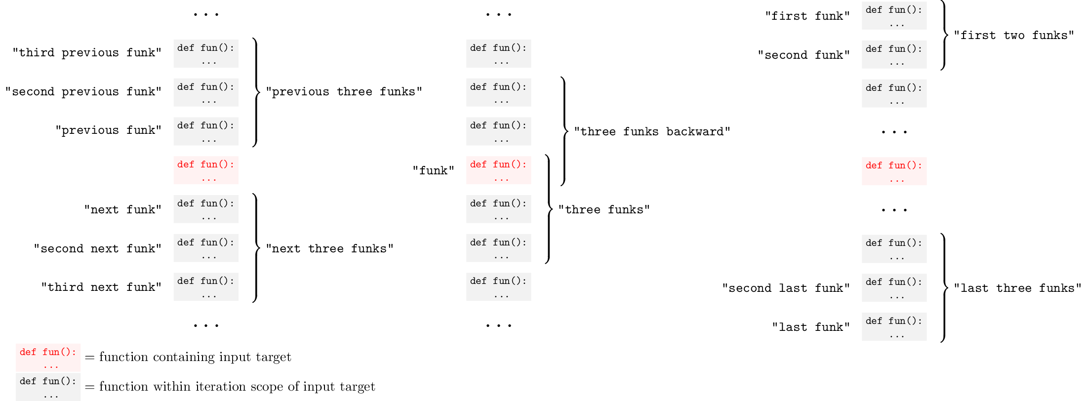
If you go back in the commit history you can see an earlier version where the funks were laid out horizontally. I gave up on that because I thought that the text would get all bunched up and look messy, but maybe it is still clearer than the vertical version? I agree that the current version looks a bit busy. Maybe it could be split up into two different diagrams, one for forward references and one for backward ones. This would avoid the three layers of nesting for the braces. We could also elide some funks to avoid the 'from here forward' references neighboring the 'from last backward' references. So something like together with braces for Happy to hear what you think. |
|
Yeah splitting into multiple diagrams is a nice idea. I think including forward / backward in one diagram is ok. But I might have 3:
I think your idea of using ellipses is nice as well, if that's easy to do. Could have ellipses at start and end of relative diagrams, and between red function and first / last in absolute diagram One concern I have is that the problem may just be with using dots themselves. It's not immediately obvious that the dots correspond to functions in source code. I'd almost be tempted to have the diagram be labelling actual code 🤔 A simple thing to do would be to change the annotation at the bottom for the red dot to say "the function containing the input target" @tararoys maybe you have some thoughts here? does this diagram make sense to you / any ideas for making it clearer? |
|
Got some time over to work on this, the newest version can be seen here |
|
That looks pretty good! :) |
Checklist
Replace the hand-written diagram of relative / ordinal modifiers with one generated by LaTeX / tikz.
If it is necessary in the future to change this image, you can reuse and modify the below latex code to regenerate it.