The percentages in a pie chart are hard to read #18
Description
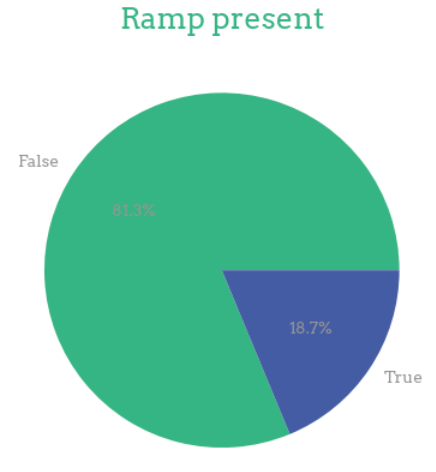
Hi, I noticed that the percentages in a pie chart are hard to read. Changing them to black might be better.
Hi, I noticed that the percentages in a pie chart are hard to read. Changing them to black might be better.