This is a proposal for a logo for the GAP computer algebra system.
Source code is (lua)latex using TiKZ, which produces a PDF that can then be converted to other formats such as PNG.
![]()
![]()
Logo without text (e.g. for icons):
| 32x32 | 48x48 | 64x64 | 128x128 |
|---|---|---|---|
![]()
![]()
Logo without text (e.g. for icons):
| 32x32 | 48x48 | 64x64 | 128x128 |
|---|---|---|---|
![]()
![]()
Logo without text (e.g. for icons):
| 32x32 | 48x48 | 64x64 | 128x128 |
|---|---|---|---|
![]()
![]()
Logo without text (e.g. for icons):
| 32x32 | 48x48 | 64x64 | 128x128 |
|---|---|---|---|
![]()
![]()
Logo without text (e.g. for icons):
| 32x32 | 48x48 | 64x64 | 128x128 |
|---|---|---|---|
When developing this logo, I tried to keep some principle in mind. First off, what is GAP? To quote the website:
GAP is a system for computational discrete algebra, with particular emphasis on Computational Group Theory. GAP provides a programming language, a library of thousands of functions implementing algebraic algorithms written in the GAP language as well as large data libraries of algebraic objects. See also the overview and the description of the mathematical capabilities. GAP is used in research and teaching for studying groups and their representations, rings, vector spaces, algebras, combinatorial structures, and more. The system, including source, is distributed freely. You can study and easily modify or extend it for your special use.
GAP is for researchers and other experts. It is not for school level mathematics.
Then I did some brain storming:
-
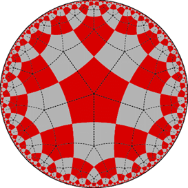
The core topic of GAP, "group theory", deals with symmetry.
- the wikipedia page on group theory has some pictures related to this
- Wikipedia page on representation theory
- Lots of nice geometry from e.g. Coxeter/reflection groups, e.g. this one
- Dynkin diagrams turn up everywhere, and classify finite reflection groups, which are archetypical for symmetry
- subgroup lattices can look great
-
If any mathematical "pictures" were to be included, it would be preferable if they were still recognizable by "many" mathematicans; so not things that are super specialized (this can of course be hard to judge...)
-
GAP is free (you don't have to pay) and open source. That means everyone can "get the source code" and thus see how it work; and thus also modify it and extend it as they like.
It also was clear that some things should be avoided:
- shouldn't resemble the logo of the famous GAP fashion company
- no "math-y looking stuff" like Pi, crazy formulas with integrals etc -- it's not about that kind of math
- The name "GAP" is an acronym; it has nothing to do with a physical "gap", so playing on things like "mind the gap" is not really appropriate either
Finally, there is an existing unofficial logo that some people use for GAP -- but this is not official in any way, so there is obligation to e.g. reference its color scheme or shape. (Indeed, I was once told that it supposedly was inspired by certain "mind the GAP" signs which we want to avoid here)
The diagram in the left part is meant to indicate symmetry, here
The letters GAP feature prominently and are arranged vertically. Since GAP is also the name of a very famous fashion brand, I do not want them being confused. The "GAP" text in the logo of the fashion company is always horizontal, ours is vertical; they use a serif font, we use sans-serif; their font is very narrow and tall, ours has almost square shapped letters.
In addition, in the full logo we spell out what the abbreviation GAP stands for, which further prevents confusion, but also is helpful to convey clearly what GAP is about. I also find the resulting look aesthetically pleasing, with the gentle slope introduced by the increasing length of the words "Groups", "Algorithms", and "Programming".
As font I chose the Ubuntu Font. It is under a liberal license that is compatible with the open source spirit of the GAP project. Its design blurb states that it aims to "convey a precise, reliable and free attitude", which of course fits well with GAP, and I happen to think it indeed achieves these aims (but of course this is highly subjective).
But I wanted a no-frills sans-serif font with clean curves; I found the Ubuntu font to be highly geometrical and it "fits" with the diagram part quite well.
I also experimented with using the mono spaced variant, "Ubuntu Mono", but in the end found the look of the base font superior for our purposes.
To be determined.