-
-
Notifications
You must be signed in to change notification settings - Fork 5.8k
Compare commits UI issue #28142
New issue
Have a question about this project? Sign up for a free GitHub account to open an issue and contact its maintainers and the community.
By clicking “Sign up for GitHub”, you agree to our terms of service and privacy statement. We’ll occasionally send you account related emails.
Already on GitHub? Sign in to your account
Comments
lunny
pushed a commit
that referenced
this issue
Nov 23, 2023
Follow-up #22844 close #28142 Before 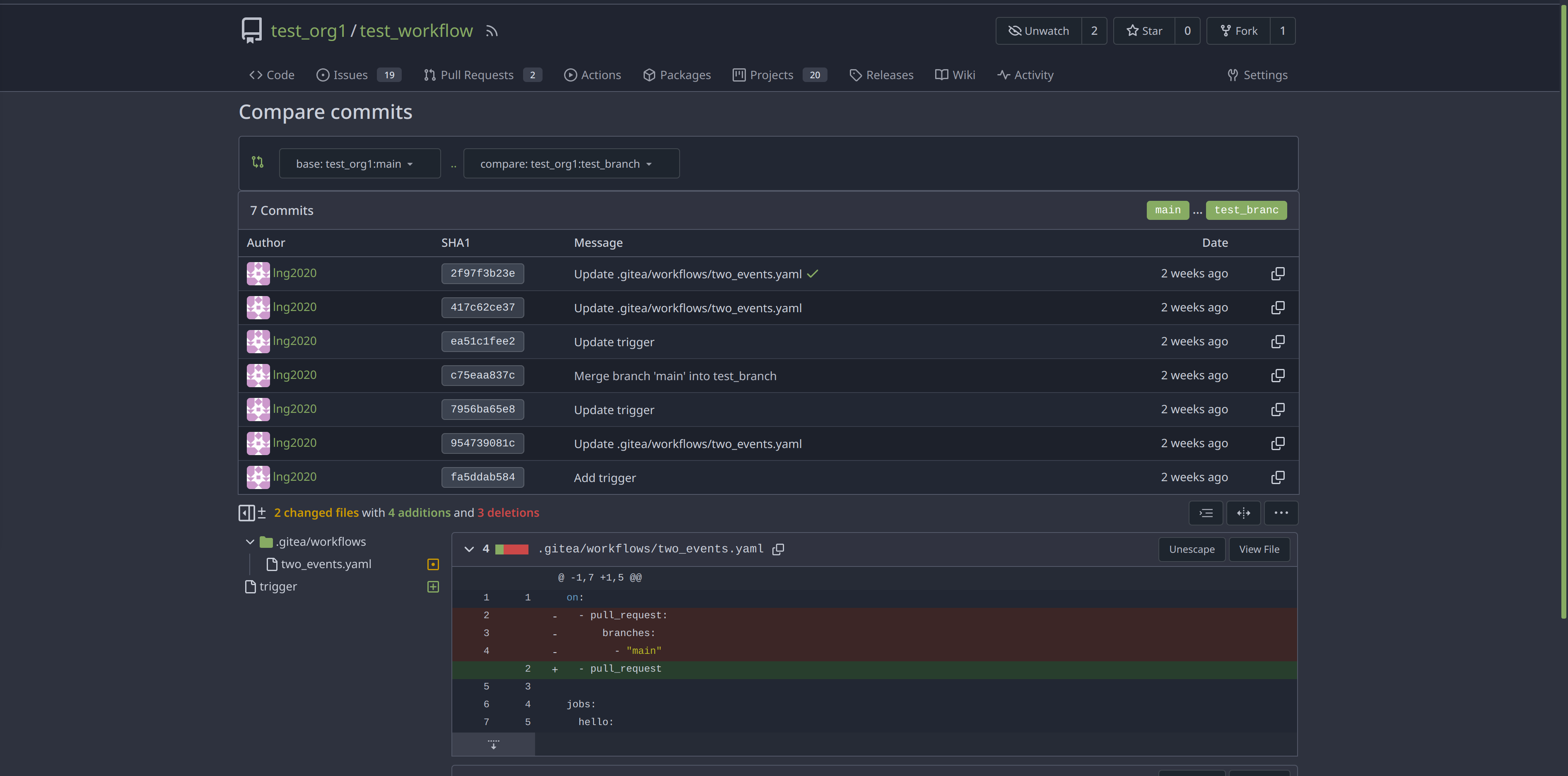 After  Co-authored-by: Giteabot <[email protected]>
GiteaBot
added a commit
to GiteaBot/gitea
that referenced
this issue
Nov 23, 2023
Follow-up go-gitea#22844 close go-gitea#28142 Before  After  Co-authored-by: Giteabot <[email protected]>
lunny
pushed a commit
that referenced
this issue
Nov 23, 2023
Backport #28182 by @lng2020 Follow-up #22844 close #28142 Before  After  Co-authored-by: Nanguan Lin <[email protected]>
fuxiaohei
pushed a commit
to fuxiaohei/gitea
that referenced
this issue
Jan 17, 2024
Follow-up go-gitea#22844 close go-gitea#28142 Before  After  Co-authored-by: Giteabot <[email protected]>
silverwind
pushed a commit
to silverwind/gitea
that referenced
this issue
Feb 20, 2024
Follow-up go-gitea#22844 close go-gitea#28142 Before  After  Co-authored-by: Giteabot <[email protected]>
project-mirrors-bot-tu bot
pushed a commit
to project-mirrors/forgejo-as-gitea-fork
that referenced
this issue
Jan 23, 2025
Backport go-gitea#28182 by @lng2020 Follow-up go-gitea#22844 close go-gitea#28142 Before  After  Co-authored-by: Nanguan Lin <[email protected]> (cherry picked from commit 28b8e0b)
Sign up for free
to subscribe to this conversation on GitHub.
Already have an account?
Sign in.
Description
Hey, I have noticed that when you are comparing multiple commits it doesn't render the view like it does when you view a single commit. It uses the full width of the screen on the single commit view whereas the compare commits is fixed with large margins on either side.
I think it should display in the same way as the single commit view does so you see the full detail more easily.
Cheers 😉
Screenshots
Gitea Version
1.21.0
Can you reproduce the bug on the Gitea demo site?
No
Operating System
Windows
Browser Version
Edge + Chrome
The text was updated successfully, but these errors were encountered: