Update UI to better match Grid & Nested Content #434
Conversation
|
@ceee, thank you for your submission. The views look great. One thing I need to ponder along with the other core team members is how this may\may not affect users who are using older versions of Umbraco core. We presumably have a lot of folks using many different versions of Umbraco with the newest version of Archetype. We have the advantage that Archetype is independent from the core and can pretty much do whatever we want on our own timeline. We are similarly disadvantaged b/c Nested Content (as of v7.7) and Grid are tightly coupled to a specific core version. As the design changes with the core, that will cascade to NC\Grid. If I knew most people using Archetype were on version x of the core, I could make some assumptions about what most of the users' experience would be. I do not have a complete picture of what that is to make an educated guess. This could be great for current generation core users and bad for legacy users. It could be good for both. So I'd like to see if any core team members have an opinion on this. |
|
I like the new styling - consistency of UI is a good thing. It will make it easier to use both NC and Archetype depending on use case without confusing editors. With regard to the issue of styling and version I guess we need to establish:
|
|
IMHO, while the styling (in this PR) does look similar to NC, I think it looks dated for Umbraco 7.7 (yup, even NC in the core looks dated to me). We tried to follow the styling of the Grid, (circa v7.2) which has since evolved from when we originally did NC. It's pretty difficult to keep up with continuously evolving back-office design. |
|
Great feedback so far everyone 👍 |
|
@ceee great work! 👍 I have two concerns:
I really think it's a great brush-up. We should definitively include it if at all possible. I'm not overly concerned that it might not be entirely up to snuff with the latest and greatest core UI, it's still an improvement. |
|
@kjac Thank you sir. The only two bits I had questions about were the two icon changes (eye and delete). not sure if they've always been around. I will download this locally and check with the full load of features turned on for the icon spacing, etc (good thinking). |
|
Thanks for your replies, everyone. Imho there's enough space for the icons on the right, but there's (for sure) a possibility for the label to exceed the available space, if long enough. I will test the code for long labels so it can wrap accordingly. I do also have another potential improvement for the icons & settings management, but that should be discussed in another PR (which I will create once I am done). |
|
@ceee I haven't tried your PR out, so there's a fair chance it already works this way... but here goes: Since the fieldset icons now only show when you hover the fieldset, a solution would be to put all the icons in a wrapper DIV that's positioned absolutely in the right hand side of the fieldset header, and let the fieldset label extend below the wrapper div if necessary. That way there's plenty of room for the fieldset label - indeed more room than there is in the current implementation. |
|
The fieldset controls are absolutely positioned, yes, but I have updated the style now so it better works with the labels. The labels have 100% now and can span across multiple lines (which wasn't possible before this PR). 1. Multi-line labels
2. Controls with label fading out
|
|
@ceee looks awesome 👍 |
|
@ceee Is there a limit to the number of lines the text can span to? Wouldn't want a full article displaying in the label, for example. |
|
@Nicholas-Westby stole the thought right out of my mind :) And as @kjac says, it looks good. @ceee When you're ready for a merge, say the word so I can review locally. |
|
@Nicholas-Westby Added a limit of 2 lines. @kgiszewski I would say it's ready, please review :) |
|
Adding water to my steam-powered computer and checking this out now ... :) |
|
@ceee looking sharp!
If you see in the above image, it doesn't match your earlier screenshot. Just wanted to confirm that my image is what you intended. |
|
Bump... @ceee |
|
Sorry. Weekend :D |
|
Ok, your example is limited to 50 chars because it's defined that way in the Another change: |
|
@ceee Has this been tested with cross-Archetype dragging?: https://github.com/kgiszewski/ArchetypeManual/blob/master/02%20-%20Configuration.md#cross-archetype-dragging Just want to be sure the new styles are compatible with the drop zones for the drag operations. |
|
@Nicholas-Westby I haven't check this yet, no. I guess there shouldn't be any problems with dragging across Archetype instances, but will test it tomorrow! |
|
@ceee Cool. Just as a heads up, this would be the number one situation I would suggest testing to ensure it isn't failing:
That is, dragging an Archetype fieldset from one property to another that is empty. When it is empty, I'm not sure there is a drop zone (at least, I don't see anything that is clearly a drop zone in the screenshot). |
|
@Nicholas-Westby good point. @ceee Let's confirm that and\or adjust to keep that functionality. Sorry for the grilling, but this is all in good diligence ;) |
|
Alright, so it did work before but I made a few changes so it looks better when cross dragging between instances. 1. Default view with cross-dragging enabled (and disabled too)
2. UI while (!) dragging
|
|
@ceee great, i'm checking out this code now |
|
Congratulations @ceee on being the newest contributor to Archetype 👍 |
|
Yeah, thanks a lot :-) |
|
The next question is usually, "so when is this getting released?". We've had a flurry of fixes go out in the last few weeks. I'm thinking we let the dust settle and shoot for maybe November 1st at the latest (unless I get impatient). |
6 participants
Hi!
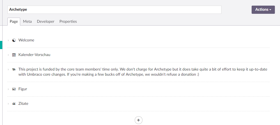
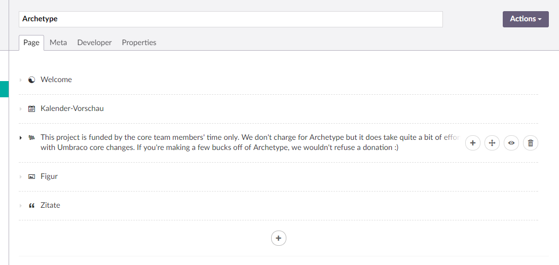
I've updated the UI so it better fits in the new Umbraco layout, specifically the Grid & NC editors.
Screenshots attached.
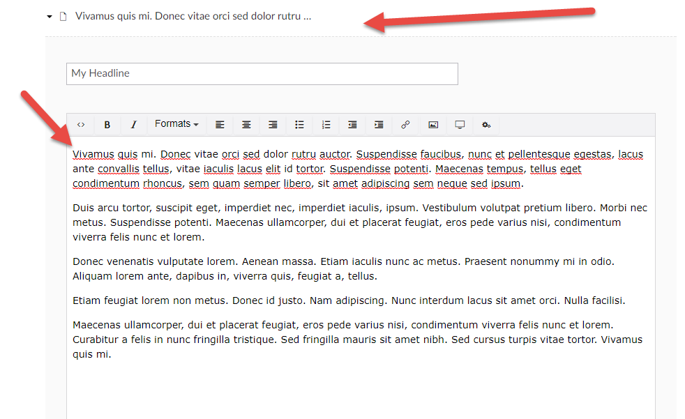
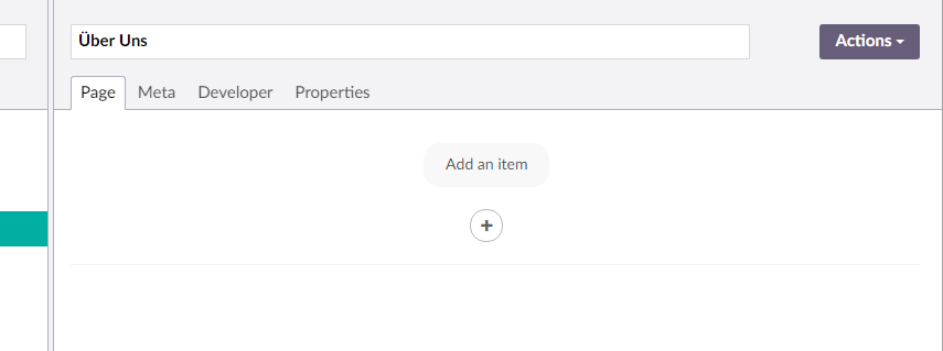
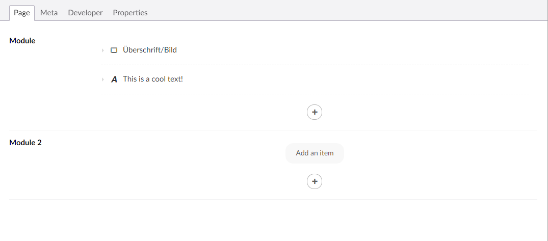
1. New UI when there is no content
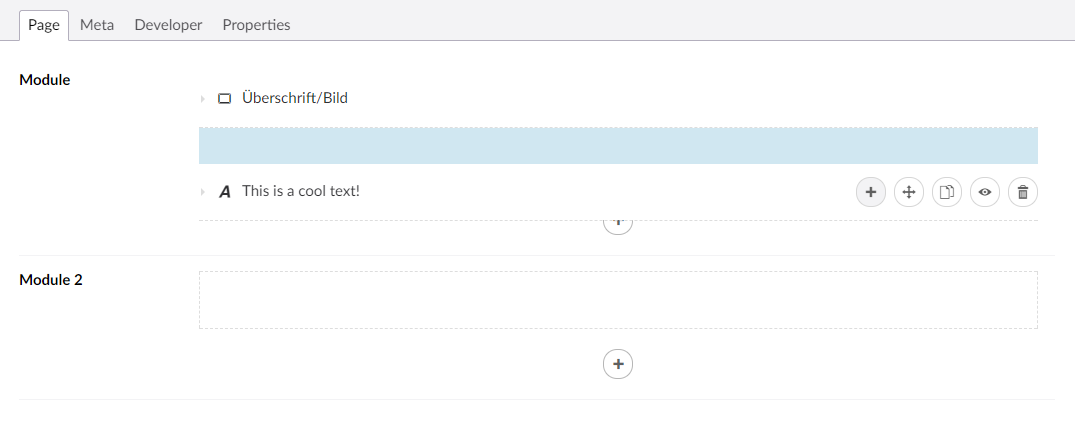
2. List style with new buttons which only reveal on hover
(add button is always attached to the bottom, in case it is allowed to add)
3. New collapser style with nested Archetype