Skip to content

Added clean monitor table for smaller screens#236

Merged
louislam merged 9 commits intolouislam:masterfrom
Ponkhy:clean-mobile-table
Aug 24, 2021
Merged

Added clean monitor table for smaller screens#236
louislam merged 9 commits intolouislam:masterfrom
Ponkhy:clean-mobile-table

Conversation

@Ponkhy
Copy link
Copy Markdown
Contributor

@Ponkhy Ponkhy commented Aug 21, 2021

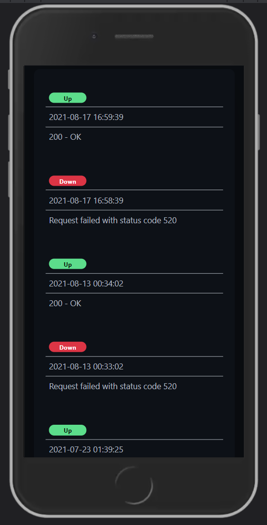
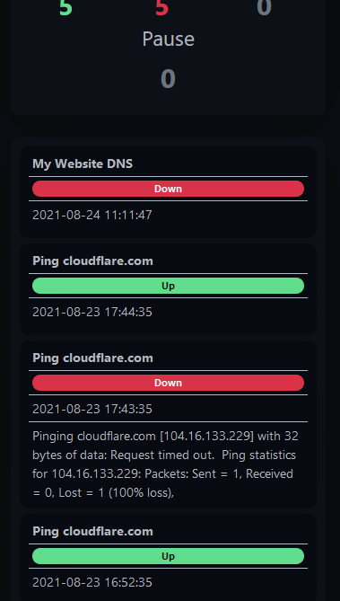
I added a different and more clean table style for smaller mobile screens.
Because on some devices it looked pretty compressed, see Example 1.
You can see the new table style in Example 2. It will only appear on a screen width smaller than 550px.

Example 1:
Example1

Example 2:
Example2

@Ponkhy
Copy link
Copy Markdown
Contributor Author

Ponkhy commented Aug 23, 2021

This should be done now or are there any suggestions?

@louislam
Copy link
Copy Markdown
Owner

This should be done now or are there any suggestions?

Overall is great. The row spacing in Details.vue maybe too big?

image

@louislam louislam added this to the 1.5.0 milestone Aug 23, 2021
@Ponkhy
Copy link
Copy Markdown
Contributor Author

Ponkhy commented Aug 23, 2021

Alright, i'll work on that tomorrow!

@Ponkhy
Copy link
Copy Markdown
Contributor Author

Ponkhy commented Aug 24, 2021

Okay, i've reduced the row spacing while not making it look too compressed.
I also centered the badge, cause the margin-top still applied on the Details page before too.

@chakflying
Copy link
Copy Markdown
Collaborator

Just as an experiment, how do you feel about making the pill full width and making the title bold?

image

@Ponkhy
Copy link
Copy Markdown
Contributor Author

Ponkhy commented Aug 24, 2021

I really like the idea of making the title bolt.
I think making the badge full width looks a bit "overwhelming", so i got another idea, how about this?

Idea01

@chakflying
Copy link
Copy Markdown
Collaborator

@Ponkhy Nice! I'm ok with that too.

@Ponkhy
Copy link
Copy Markdown
Contributor Author

Ponkhy commented Aug 24, 2021

@chakflying Alright, I added the commit a17c14e and also made the title bolt.

If you have a better approach on the change feel free to correct it!

@louislam
Copy link
Copy Markdown
Owner

Dimmed the color of border line, if it is ok, I will merge to master branch.

image

@Ponkhy
Copy link
Copy Markdown
Contributor Author

Ponkhy commented Aug 24, 2021

@louislam For the dark mode i totaly agree!
Unfortunately it looks too dark on the light mode.
Are you adjusting it for the light one or should i?

LightModeBorder

@louislam
Copy link
Copy Markdown
Owner

@louislam For the dark mode i totaly agree!
Unfortunately it looks too dark on the light mode.
Are you adjusting it for the light one or should i?

LightModeBorder

That is unexpected. I thought I added inside .dark....

@louislam
Copy link
Copy Markdown
Owner

image

Just recheck, it is ok in my side. Strange.

@Ponkhy
Copy link
Copy Markdown
Contributor Author

Ponkhy commented Aug 24, 2021

Ohh i'm sorry it's my false, i didn't read and pull properly.
Yes we're good now, looks perfect!

@louislam louislam merged commit 13f6c79 into louislam:master Aug 24, 2021
@Ponkhy Ponkhy deleted the clean-mobile-table branch September 11, 2021 20:09
Sign up for free to join this conversation on GitHub. Already have an account? Sign in to comment

Labels

None yet

Projects

None yet

Development

Successfully merging this pull request may close these issues.

3 participants