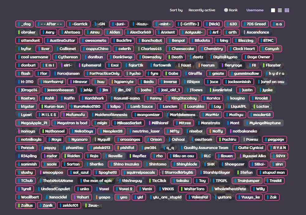
backgrounds of brick user cards are distracting #6647
Description
probably more of a personal nitpick if anything but posting here to see if anyone else feels the same way. the brick user cards show user banners in the background, but they're so small that I can barely tell what any of them are, and it ends up looking more like random colors that make the text stand out less for no reason
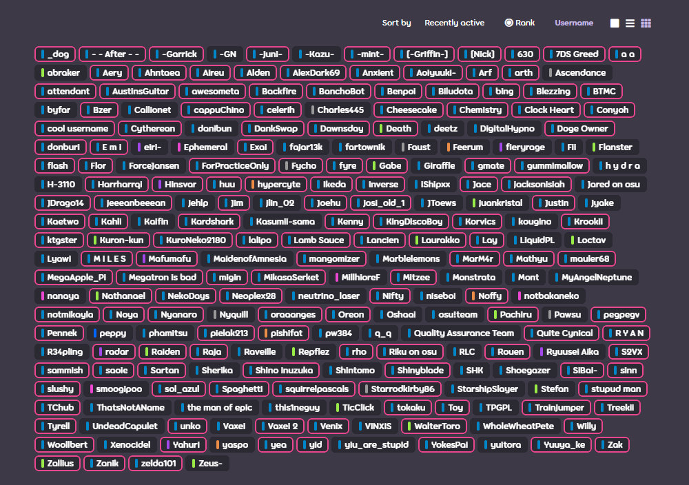
with background (current) vs without background
I find that without the backgrounds it's a bit easier to visually parse a large list. it would also make the page load faster without all of the images