-
Notifications
You must be signed in to change notification settings - Fork 2.1k
new geom suggestion: separate lines for upper and lower intervals #3503
New issue
Have a question about this project? Sign up for a free GitHub account to open an issue and contact its maintainers and the community.
By clicking “Sign up for GitHub”, you agree to our terms of service and privacy statement. We’ll occasionally send you account related emails.
Already on GitHub? Sign in to your account
Comments
I agree with you. I don't come up with some nice idea for now, but I don't think we need a new geom as this won't be so difficult. e.g. library(ggplot2)
# Example data
df <- tibble::tibble(
y = c(0, 0, 0, 0, 0, 1, 1.5, 1.7, 1.8),
upper_y = y + 0.2,
lower_y = y - 0.2,
year = -4:4
)
StatErrorLine <- ggproto("StatErrorLine", Stat,
required_aes = c("x", "ymin", "ymax"),
default_aes = aes(y = stat(y)),
compute_group = function(data, scales) {
idx <- names(data) %in% c("y", "ymin", "ymax")
data_min <- data_max <- data[!idx]
data_min$y <- data$ymin
data_min$group <- paste0(data$group, "-min")
data_max$y <- data$ymax
data_max$group <- paste0(data$group, "-max")
rbind(data_min, data_max)
}
)
p <- ggplot(df, aes(year, y)) + geom_line()
p +
geom_line(aes(ymax = upper_y, ymin = lower_y), linetype = 2, stat = StatErrorLine) Created on 2019-08-29 by the reprex package (v0.3.0) |
I'd thought of it as a geom since I was thinking the more common use case would be one where the upper/lower bounds are provided in the data (e.g. confidence intervals from a model that has been passed through |
Now I come to wonder if we can just write this with ggplot(df, aes(year, y)) + geom_line() +
geom_ribbon(aes(ymax = upper_y, ymin = lower_y),
linetype = 2, fill = NA, colour = "black") I mean, it's just an implementational detail that devtools::load_all("~/Documents/repo/ggplot2")
#> Loading ggplot2
df <- tibble::tibble(
y = c(0, 0, 0, 0, 0, 1, 1.5, 1.7, 1.8),
upper_y = y + 0.2,
lower_y = y - 0.2,
year = -4:4
)
# can divide the ribbon
df[4, "upper_y"] <- NA
df[4, "lower_y"] <- NA
ggplot(df, aes(year, y)) + geom_line() +
geom_ribbon(aes(ymax = upper_y, ymin = lower_y),
linetype = 2, fill = "red", alpha = 0.1, colour = "black") Created on 2019-09-02 by the reprex package (v0.3.0) I'm not sure if this really will be an acceptable change, though... |
Something like this would be great. Is the worry that users might expect |
I expected there's effectively no such users, but I'm not fully sure... Just curious, have you ever seen such a usage? |
Just to make sure we're on the same page, are you asking if I've seen someone use |
Yes, that's what I meant to ask. Thanks. |
I'm wondering if there's room for a new geom that can produce the following graph
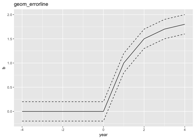
So instead of having to use
geom_line
twice, you could instead doand this would fit more neatly into the idea of mapping the upper and lower intervals to the
ymin
andymax
aesthetics.I imagine there's a way to achieve that same plot with
geom_ribbon
orgeom_area
but I haven't been able to do so so I'm guessing it wouldn't be straightforward even if there is.Here is a prototype I wrote a few years ago: https://github.com/weiyangtham/econothemes
Thanks!
The text was updated successfully, but these errors were encountered: