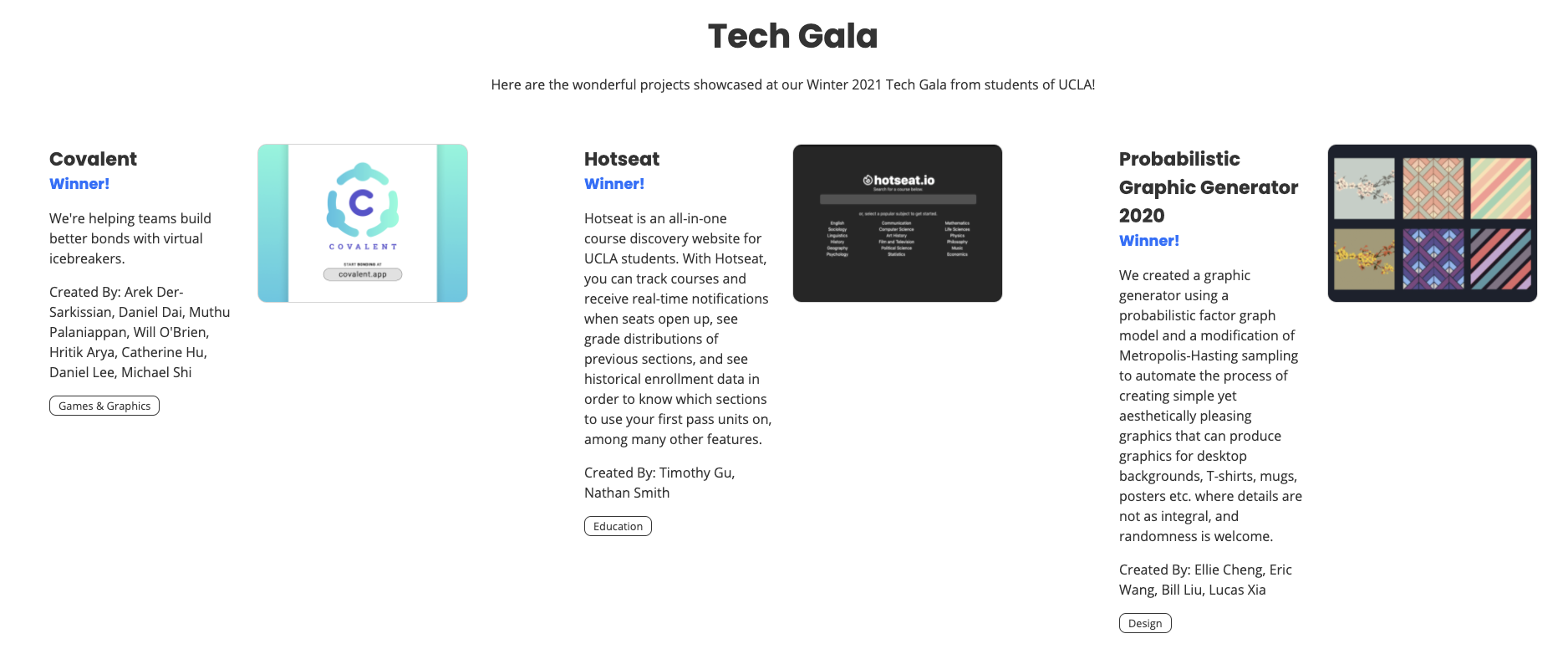
Tech Gala Projects W21 #99
Conversation
There was a problem hiding this comment.
Looking good!
I reviewed mainly on design and UI choices, and only gave a cursory glance at the code (but that looks well done as well). I left some comments on specific sections of the diff.
Some takeaways I have:
- The layout is narrow, while mobile friendly, it feels a little cramped when viewed on a widescreen. Can we try a 3-column layout? I messed around with the inspector to get a rough mock (of course we could move thing around like the images, text, names etc to get everything to fit more smoothly)
- I like where this banner is going, we just need to figure out where in the layout it belongs. The way we currently position
<Banner>component is very hacky, with negative margins etc. so finding a good solution here will be tough.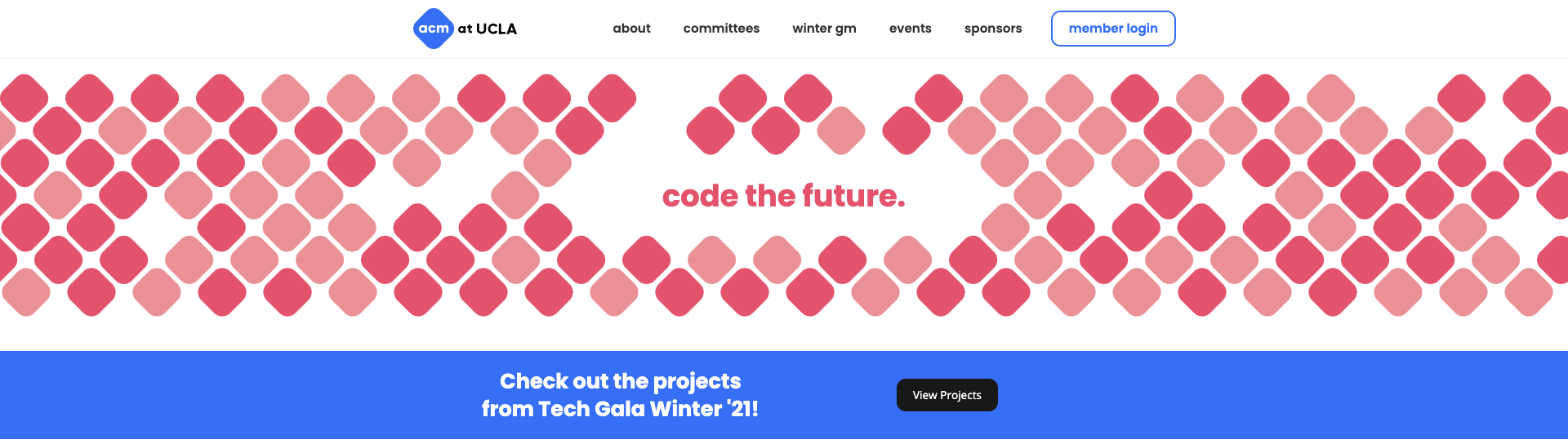
- We don't link to this page in the nav-bar so it's difficult to find unless you know where to look. I realize this might be a conscious choice, however, as our nav bar is getting a little full.
There was a problem hiding this comment.
Great work so far, Julia! Got a couple of suggestions for you before we can get this up:
[Issues to fix]
- The images on the committees page have grey borders when they shouldn’t:
This is probably an issue with either your css or how you define the image items on your Tech Gala page, so it bled out to the images on the committees page. This will need to be fixed before the page can be deployed.
[Suggestions]
can we change the Winner! labels to the individual places instead?EDIT: Ignore this and go with Evan's suggestions on them- It’d be better to make the tags a different color than black, such as one of our pre-defined ACM blues, which you can find defined in
App.scss. - For the few projects that did provide us links, we should add them as well if possible.
[Design-wise]
- considering the time-sensitivity, this current design is overall good to be deployed. Some improvements we can consider design-wise (now or eventually) would be having the 1st/2nd/3rd place projects out in a row at once, or some greater distinction to single them out as winners (maybe a more graphical pedestal?)
- Also, if we get a larger amount of projects than currently, scrolling through would take a long time. Some options would be changing it to a more grid layout, adding pagination within the page, or something else more compact.
Again with the time crunch, it's fine to save most of this design section for a later date. [EDIT: submitted this review before i realized you reviewed already my bad evan LOL]
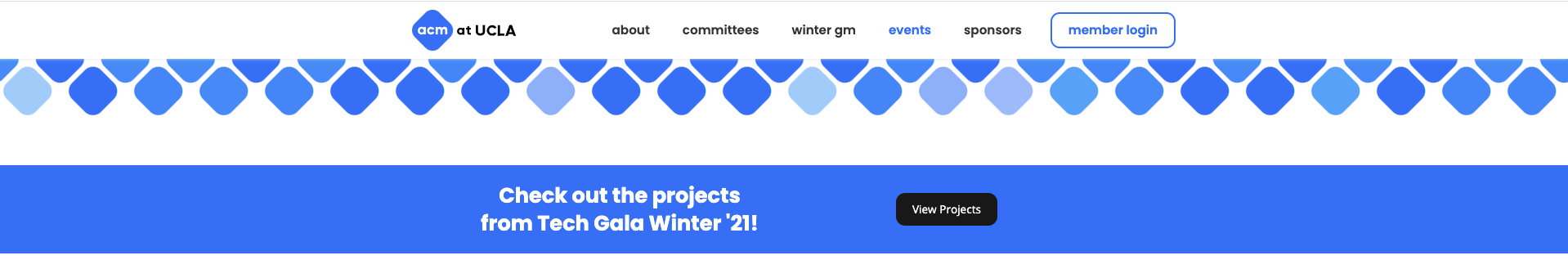
And adding another comment here, just so it's noted down––regarding how to access it, the tech gala page is currently accessible through a banner on the home page or the events page. This is great! This does though ask the question of how to handle future events pages, such continually adding more items in the nav bar (such as winter gm) or adding more banners (tech gala), neither of which is sustainable. Eventually we should either modify the events page to be more of a landing page for all individual event pages, or by making its nav item as a dropdown for all events. This can be another future ticket for the website.
Overall, loving everything you're doing, Julia <3 Keep up the great work!
Co-authored-by: Evan Zhong <[email protected]>
Co-authored-by: Evan Zhong <[email protected]>
Co-authored-by: Evan Zhong <[email protected]>
Co-authored-by: Evan Zhong <[email protected]>
|
Hey, just wanted to check in - @julia-yin or @vohndernet, what's blocking this PR right now? Anything on our end we can do to help? |
|
resolved the conflict (caused by me this time around, mb!) @julia-yin there are still come CI failures, most of them are autofixable! |
There was a problem hiding this comment.
Hey Julia!
Everything looks great! I've left some minor comments in individual files. None of them should block you from merging this but here's the overview:
- We can make your code more readable using object destructuring
- Considering the tradeoff between performance and reducing file pollution by using inline-CSS
- We usually make sure all files have an empty line at the end (as git convention). There's no need to manually do this now, as we can add an eslint rule and run it on these files later.
Great work!
| .tag { | ||
| color: #1E6CFF; | ||
| font-size: 0.8em; | ||
| border: 1px solid #1E6CFF; | ||
| border-radius: 8px; | ||
| display: inline-block; | ||
| padding: 2px 10px; | ||
| } |
There was a problem hiding this comment.
Since the Tag component is currently small, what you can consider is moving this styling to to the Tag.js file instead. (i.e. with inline-CSS <div style={styles_object}></div>
This would reduce the number of new files this PR introduces which, while small, helps make our codebase more maintainable.
On the other hand, inline CSS generally suffers from poorer performance.
Decision is ultimately up to you
| .projects-container { | ||
| margin-top: 20px; | ||
| } |
There was a problem hiding this comment.
Similar comment here as what I wrote about Tag.scss
| .banner-info { | ||
| margin-top: 30px; | ||
| } |
There was a problem hiding this comment.
See above comments about inline-CSS
| import Tag from './Tag/Tag'; | ||
|
|
||
| function ProjectCard(props) { | ||
| return ( |
There was a problem hiding this comment.
This is perhaps personal preference, but I'm a big fan of "object destructuring". I think it makes code more readable and makes things DRYer (DRY is an acronym for "Don't Repeat Yourself").
For example you can do
| return ( | |
| const {image, title, winner, summary, names, url, category} = props.project; | |
| return ( |
to create a bunch of local variables holding the information you want, then you can simply reference these variables instead of the props.project. object in your returned HTML.
|
In general I'm good to merge, but looks like we'll have to resolve a few merge conflicts before moving ahead. We can work on this in today's meeting, or later! |
Created the Tech Gala Projects page for Winter 2021. Added Tech Gala banners to the Home and Events pages.