Layout changes accessibility #111
Conversation
to accomodate for two new fields
leaving rest for another branch/PR tbc
…or into layout-change
This reverts commit 2c6a9dd.
removed volume component and added titles tags to player controls btns
mobile break point
eg linting, css etc.. from James' PR feedback
+ Range bar re-styled
|
Thanks for this @ivanji , we are having a closer look with @jamesdools tomorrow. I reckon we could hide the Picture in picture icon in mobile view as it doesn't seem be supported in iOS, or android, and that could make more space for other icons. |
|
Sure, thanks. BTW, I'm going to push a couple more changes as I've been testing further and found some minor issues. I'll get rid of PiP in mobile view and bring back the sound control button, it's an accessibility issue not having it and there's no reason why it shouldn't be present. |
|
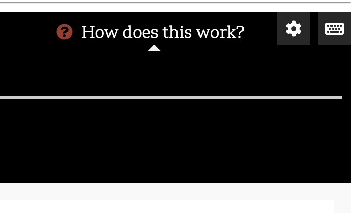
ok, cool, thanks @ivanji ! re the sound toggle - ok that's good. A few other things I've noticed Progress bar Current Timecode - colour Position of settings icon, and keyboard shortcuts icon
ToolTip
|

+ Added Toggle sound
|
I've fixed these issues and some minor ones I also noticed. I added Toggle Sound on/off button (instead of volume control as realistically that's what it is).
Accessibility! previous red fails contrast checks. FYI, I didn't remove it, just added a new colour but like anything, it's to the devs what style they ultimately decide on, but hopefully always considering contrast. As a default option we might as well comply with best guidelines :) |
Is your Pull Request request related to another issue in this repository ?
#50
Describe what the PR does
Continuing on work done by @pietrop on #70
State whether the PR is ready for review or whether it needs extra work
Ready for review
Additional context
