Conversation
to accomodate for two new fields
leaving rest for another branch/PR tbc
9bb5541 to
69b1e24
Compare
|
Outstanding:
|
…or into layout-change
f0bd8ad to
ee20146
Compare
This reverts commit 2c6a9dd.
removed volume component and added titles tags to player controls btns
mobile break point
|
First pass at making it gracefully adapt for mobile view. #49
|

|
Added an extra break point for ipad in portrait mode
It keeps the two columns for video and timed text editor, but inside the timed text editor rearranges speaker names and time-codes to be slightly more compact (same as in mobile view) there's room for improvement |

|
 jamesdools
left a comment
jamesdools
left a comment
There was a problem hiding this comment.
I'm going to reject this for now - the styling is not quite there. Probably will have time to help out after the project cycle!
Might need a bit more UX input, especially while the rest of the project is changing too. I suggest we park this or tidy this up completely before it gets into master.
|
|
||
| <div className={ style.btnsGroup }> | ||
| <button | ||
| title="seek backward by a set interval" |
There was a problem hiding this comment.
Good to have these titles I think - but some uniformity would be good (text-wise)
There was a problem hiding this comment.
Yeah, fair, we had some feedback from UX about research they have been done on naming, I think this should be noted down for our next batch of user testing follow up questions, to ask how they would refer to the various functionalities, for naming.
| title="Picture-in-picture" | ||
| className={ style.playerButton } | ||
| onClick={ this.props.pictureInPicture } | ||
| > |
There was a problem hiding this comment.
The formatting for closing elements > on the last line of a property / new line seems to change a lot
There was a problem hiding this comment.
yeah, preference? should it just be up on the previous line?
| .playerControls { | ||
| margin: 1em; | ||
| display: flex; | ||
| /* margin: 1em; */ |
There was a problem hiding this comment.
Lets get rid of as much CSS half-fixes and comments as possible - it gets confusing if you're not the one who wrote it!
| import PropTypes from 'prop-types'; | ||
|
|
||
| class VideoPlayer extends React.Component { | ||
| constructor(props) { |
| } | ||
|
|
||
| handlePlayMedia = () => { | ||
| console.log('handle media', this.props.videoRef.current, this.props.videoRef); |
| .speaker { | ||
| display: inline-block; | ||
| width: 50%; | ||
| padding-right: 2em; |
There was a problem hiding this comment.
This offsets everything onto a new line:

There was a problem hiding this comment.
This was quite tricky to get right the first time (even though it wasn't perfect), and so i'm reluctant to merge in these changes. In addition to the iphone / ipad view, the middle-sizes on desktop should be checked too.
There's a lot of space around the video player, where it could either take up the aside width or give more room to the editor

There was a problem hiding this comment.
Yes, I think these needs to be addressed when we look at the media query breakpoints for the responsive design. So that as you said we can tweak for each size the various un-utilised spaces etc..
| text-overflow: ellipsis; | ||
| overflow: hidden; | ||
| white-space: nowrap; | ||
| /* Mobile devices */ |
There was a problem hiding this comment.
The WrapperBlock part looks good for the mobile widths 👌
I would maybe give the html/body a min-width of 320px so it doesn't squash down anymore.
| /* Mobile devices */ | ||
| @media (max-width: 768px) { | ||
|
|
||
| .markers { |
There was a problem hiding this comment.
In mobile view, the speaker labels and timecodes are just a bit too close to the text. adding a margin-bottom would help
There was a problem hiding this comment.
ok changed to be
.markers {
...
    margin-bottom: 0.5em;
and
.WrapperBlock {
...
    margin-bottom: 1em;
see what you think, we can tweak this
| @@ -1,8 +1,12 @@ | |||
| @value color-darkest-grey, color-light-grey, color-labs-red from '../colours.module.css'; | |||
|
|
|||
| .playerControls { | |||
There was a problem hiding this comment.
This section needs rethinking. The player controls and the grouped buttons within could probably be centred and responsive to narrow screens with flexbox and + wrap? Not sure how fiddly that'll be.
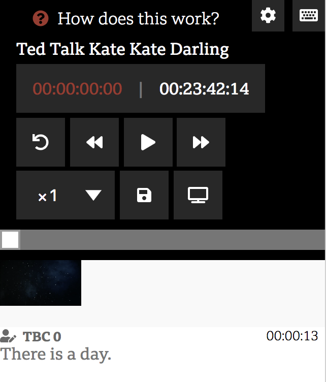
I find here the Timebox is too far away from the player + progress bar. Also the huge grid of buttons is overwhelming. An alternative for mobile could be player controls + timebox stuck to the bottom of the screen?
Probably needs more UX input rather than winging it. We're undoing a lot of stuff from the first round of UX in this PR so let's not get carried away 😛
Also, any idea why the MediaPlayer size doesn't update properly a lot of the time?
There was a problem hiding this comment.
Yeah, we can rethink it, I reckon we can just do a first pass in this PR and then optimise later. Not good to try and do everything at once.
| <section className={ style.settingElement }> | ||
| <div className={ style.label }>Display Preview</div> | ||
| <Toggle | ||
| defaultValue={ this.props.previewIsDisplayed } |
There was a problem hiding this comment.
PropTypes missing for a lot of things on this branch. About 30+ things to tidy up on npm run lint too
There was a problem hiding this comment.
ok fixed them all.
/src/lib/TranscriptEditor/index.js
  284:18  warning  Arrow function should not return assignment  no-return-assign
  285:23  warning  Arrow function should not return assignment  no-return-assign
  286:23  warning  Arrow function should not return assignment  no-return-assign
these refer to this:
<MediaPlayer
...
      hookSeek={ foo => this.setCurrentTime = foo }
      hookPlayMedia={ foo => this.playMedia = foo }
      hookIsPlaying={ foo => this.isPlaying = foo }
I have to admit I don't fully understand how this works, and what could be an alternative way to do it (from a syntax point of view) I think this patter was originally introduced by @Laurian (?)
eg linting, css etc.. from James' PR feedback
|
Could I contribute my changes? Please see attached. I'm using CSS grid instead and responsiveness it's pretty much taken care of. I still want to take care of some alignment issues, but happy to take on this issue instead and let @pietrop attend to more critical ones.
|


|
Hi @ivanji , That's awesome, thanks! One of the things to keep in mind is making sure the component can still work when used into a parent component that might have a different CSS setup (still using css modules tho - for now) if that makes sense? But we can always test that later. |
|
closing in favour of #111 |
Is your Pull Request request related to another issue in this repository ?
Suggested Layout change #50
TL;DR:
Describe what the PR does
VideoPlayerpreview intoTranscriptEditornext toTimedTextEditorState whether the PR is ready for review or whether it needs extra work
Still doing some tweaks, and cleaning up, should be ready for review soon.
Outstanding
Additional context